
 displays ink color matches that are consistent, ensuring that label print jobs are high quality. "Pin It")
It’s never an easy phone call to make. One of my production manager’s picked up the phone to hear me say “ the job is out of spec, and has to be re-run. It was a 187 Pink match, but the shade is off.”
PMS Label Background
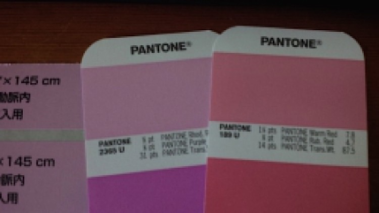
The Pantone Matching System (PMS) allows for coordinating color matches that are consistent and that meet everyone's expectations. In this case, my customer has a PMS 189 Pink specified for their label background. When the job was inspected, QC rejected it because the background color was closer to a PMS 2365.
Critical PMS Matches
One of the most challenging jobs I’ve ever had was a project for Grumbacher Corp. Grumbacher makes hobby paints. I was tasked with producing labels that matched each color perfectly. Then there was the job that involved a PMS orange match. I remember spending nearly a day with in a light box, trying to match the PMS chip perfectly. The light box allows for better visual matching, and removes any variables due to fluorescent lighting, improper lighting, etc. Color matches are critical for cosmetic companies' labels, but may not be as critical for other jobs. It all depends on the function of the label, its intended PMS colors, and what the customer expects.
In some cases, for larger ongoing jobs, the PMS colors can be ordered pre-mixed from the ink manufacturer. Typically though, PMS colors are mixed at press-side by following the recipe. In the case of PMS 189, it would be mixed as follows: 1-1/4 parts or 7.8% of Pantone Warm Red, 3/4 part or 4.7% of Pantone Rubine Red, and 14 parts, or 87.5% of Pantone Transparent White.
Sometimes though, production mixes the ink perfectly, only to be told they were off a shade. There can be reasons for this other than an improper match:
- PMS book is outdated and the pages have faded
- The match is on a substrate that absorbs light differently from the paper used in PMS books
- The match was targeted for a coated material, when it should have been targeting for an uncoated material
- One of the inks may have an expired shelf life, or close enough to the expiration date where the pigment differs
How can you minimize quality rejections due to improper PMS matches? Here are a few suggestions:
- Keep PMS books up to date and replace every year or two years
- Keep PMS books away from sunlight and don’t store them in your car
- Make sure you can meet your customer’s expectation’s; sometimes a 1 shade variance is good enough for their requirements
- Understand and convey that different material surfaces reflect light differently, which in turns effects the shade
- Buy pre-mixed inks
- Have more than a single set of eyes approve a press set-up; in some cases simply requiring a second set of initials on the QC log will improve the odds of perfect matches
Of course, with the influx of digital printing, colors are often specified as percentages of the Cyan, Magenta, Yellow, and Black inks, which can comprise all colors. That is a topic for another time. For now, it is important to understand customer PMS requirements, how to use a PMS book for color matches, and how to meet those requirements on a consistent basis.
Published: